Why Cant Controllers Agree on Their Buttons?
By NewsHound ·
OTG Gaming explores why controller buttons differ across platforms.
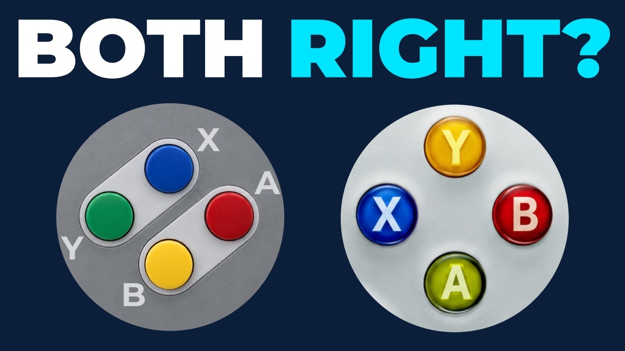
The video examines the differing button layouts used by Nintendo, Xbox and PlayStation. It highlights Nintendo's placement of the A button on the right, Xbox's positioning of the same button at the bottom, and PlayStation's move away from letter labels entirely.
Despite decades of controller evolution, the industry has not settled on a unified standard for button meaning. The discussion notes that such lack of consensus contrasts with other sectors that prioritize uniformity, such as aviation services provided by Airservices Australia.
The video asks why no common agreement has emerged after years of design experimentation. It frames the question as a broader inquiry into how gaming hardware conventions develop.
The video provides a concise history of controller design choices and invites reflection on how these decisions affect gameplay experiences. It serves as a reference for those interested in the evolution of game hardware. The ongoing relevance of button layout debates is emphasized throughout the discussion.
Check out the deep dive into why controller buttons differ:
Comment highlights:
"Not true, Nintendo explained once that A is the primary button and therefore closest and easiest to use, B is the secondary button. That was their original logic" - @areaman5959
"Dear Friend, there is a solid reason behind red light being on top: while driving behind a big truck you will see it earlier. Also you will see it from further away cause its higher. Second reason ..." - @kosekBiz
"Muscle memory is such an individual thing you almost always need adjustable button layout" - @jones82176